HHMI BioInteractive Website
Empowering teachers. Inspiring students.
Project Type
Website Redesign
My Role
UX Lead
Technology
Drupal
Tools
Figma, Sketch, InVision
Team Credits
User Experience Designer: Maddie Purcell
Visual Designers: Jamie Bourne, Corey Jones
Tech Leads: Norman Bucknor, Matt West
Back-End Dev: Rose Davidson
Front-End Devs: Tommy Alter, Sathya Ram
Analytics: Adam LaCaria
Quality Assurance: Mathew Murakami, Nora Wahlund
Account Managers: Jordan Craig, Hannah Webster
Project Manager: Cole Vance
Solutions Architect: Jeff Traynor
Date launched: June 2019
The Client
HHMI BioInteractive provides free resources and teaching support to tens of thousands of life science teachers at the high school and undergraduate level. Their "resources are designed to connect students to big ideas in biology, promote engagement with science practices, and instill awe and wonder about the living world." BioInteractive is a part of the Howard Hughes Medical Institute’s Department of Science Education.
Target Users
Primary: High School and College Science Educators
Secondary: High School and College Students
Client’s Goals
Be the go-to source for quality materials for teaching biological sciences
Better promote their professional development content, as well as their resources to teachers
Upgrade the technology and ensure that it is reliable and easy to use / update / maintain
Project Goals
Provide a customized and personalized logged-in experience for users
Help educators plan their lessons / units / syllabi for the year
Make resources easy to find
Support discovery of related and relevant content
Support educators in professional development (events, online courses, etc.)
Be accessible, responsive, and mobile-friendly
Be beautiful, engaging, and easy to use
Challenges
Accommodating feedback from a large number of stakeholders. *Shoutout to BioInteractive’s Project Manager, Bridget Conneely for effectively managing the feedback and being essential to the success of this project.
Fast timeline (Aug 2018 - June 2019)
Key Takeaways
This project was (dare I say it) a practically perfect project, and I was very lucky to work with a very dedicated and talented team, on both the Forum One side and the HHMI BioInteractive side. I was able to establish a lot of trust between myself and the client by worked very closely with them throughout the process. We also were able to get valuable user feedback and buy-in by interviewing a handful of them and by testing wireframes with them. Their input, as well as analytics from the old site, helped drive many key decisions that went into designing this site. I also grew a lot and became more confident in my abilities to lead meetings of many types - whether they be workshops, collaborative working sessions, user interviews, presentations, etc.
Old Site
The Process
Discovery
Workshops
Initial wireframes
Budget estimation, technology recommendations, and new contract
Design
Usability testing of wireframes
Wireframe updates
Site map and content model
Visual design concepts
Page designs
Product requirements
Development
Acceptance criteria writing and supporting the developers
Quality assurance testing
Content migration
Launch
Site goes live
Workshops
In the discovery phase, I had the benefit of working with the BioInteractive team and our solutions architect to come up with a vision and a plan for the new BioInteractive website. I led workshops with the client to dive into ideas for the new site. In these workshops, we covered the following topics:
Goals for the new site
Pain points and challenges of the existing site (at the time)
Audiences and their needs
Content on the present site and content for the new site
Sketching activity to brainstorm features for a potential logged in user dashboard
These workshops gave us a sound start by giving us valuable background information, buy-in from stakeholders, and alignment on goals and audiences. In the case of this client, we were fortunate they were able to empathize with their users needs - partially because they have frequent contact with a select group of educators that serve as their ambassadors.
Initial Wireframes
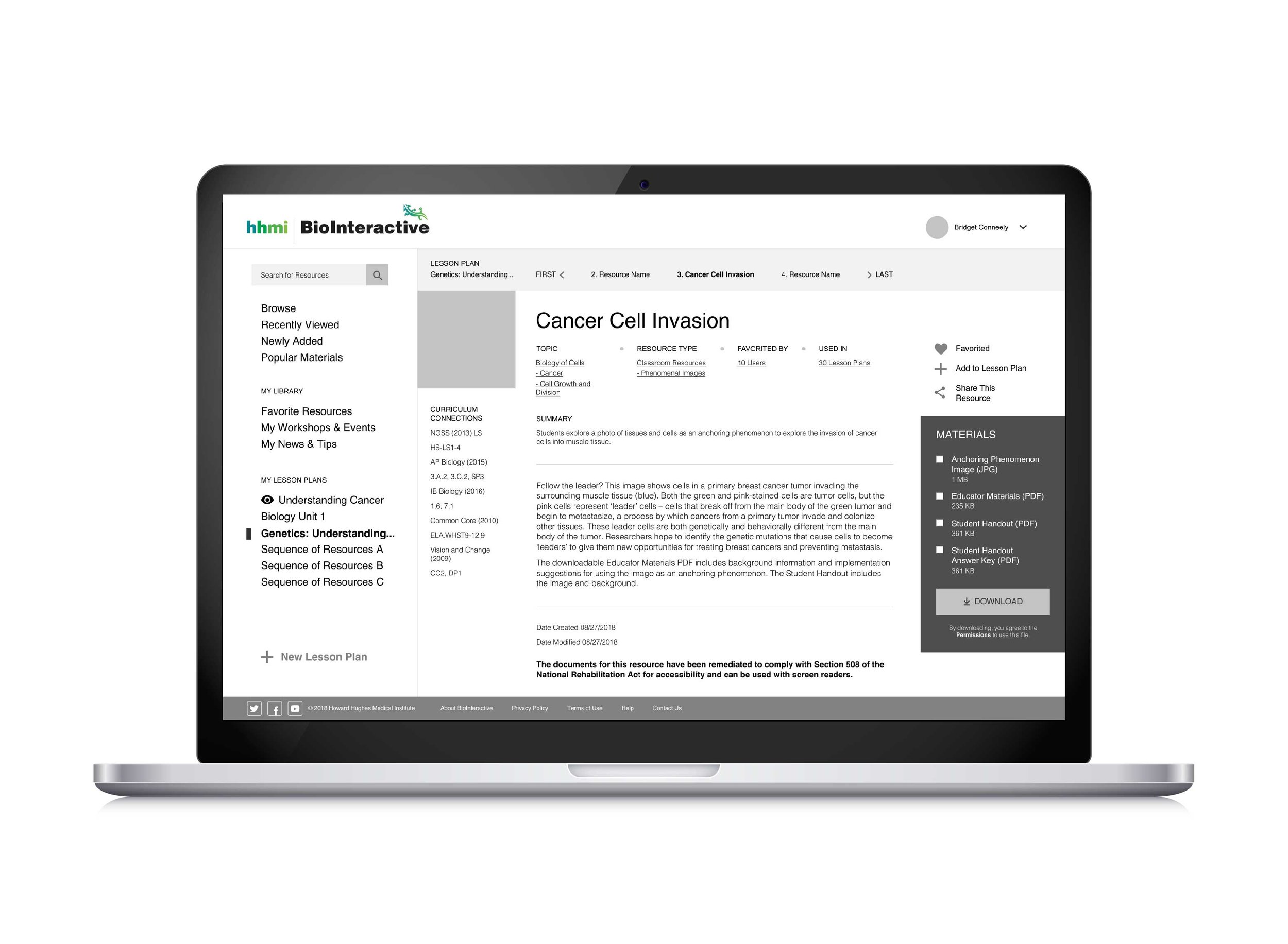
After these workshops, I created the first iteration of wireframes to capture the ideas of our teams and key features that could be present on the new BioInteractive site. These wireframes explored how we could provide educators the abilities to:
Save their favorite resources
Create their own groupings or playlists of resources for use in a lesson or unit with their class
Easily discover other content that is relevant to them
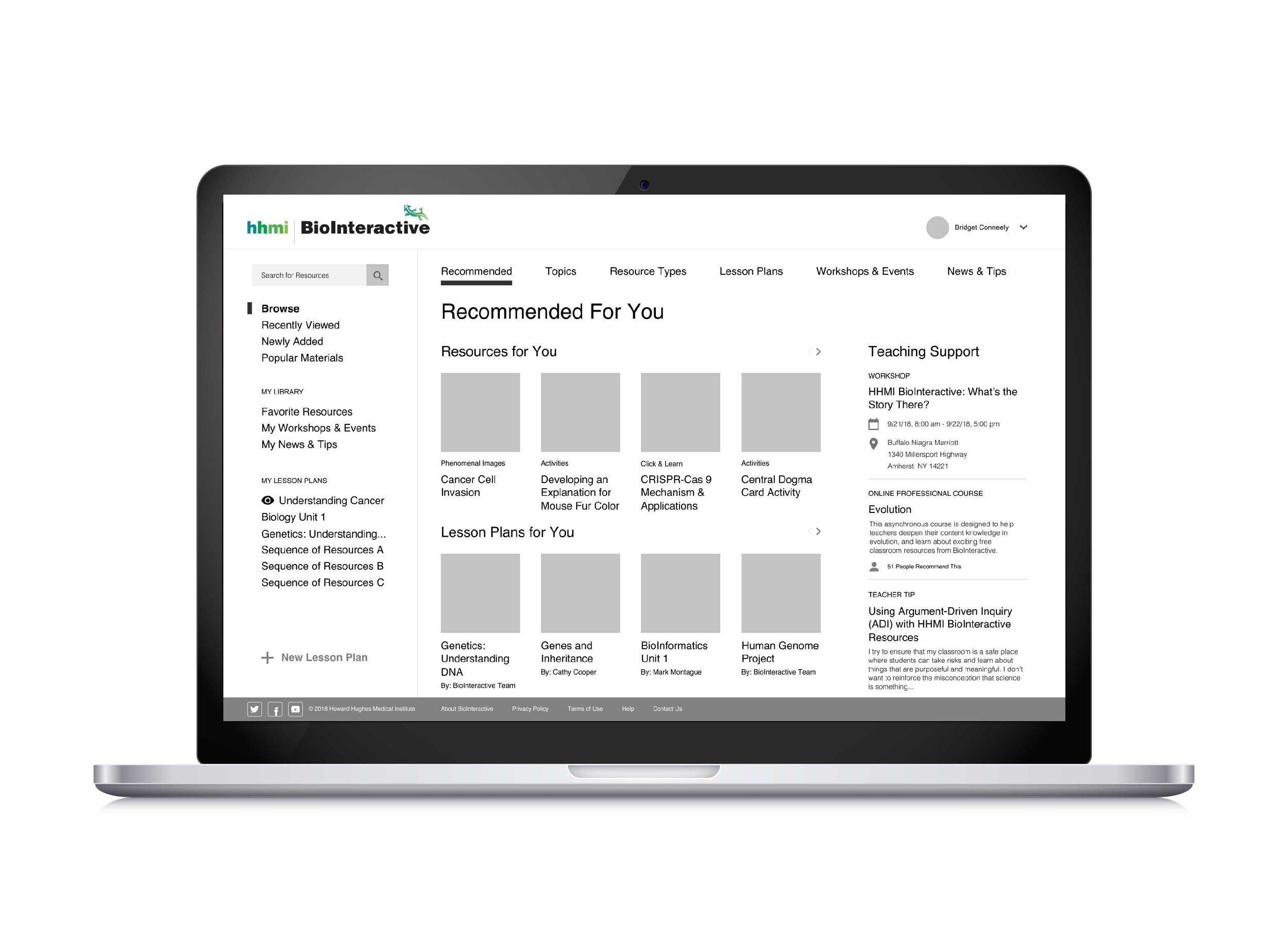
Logged In User Dashboard
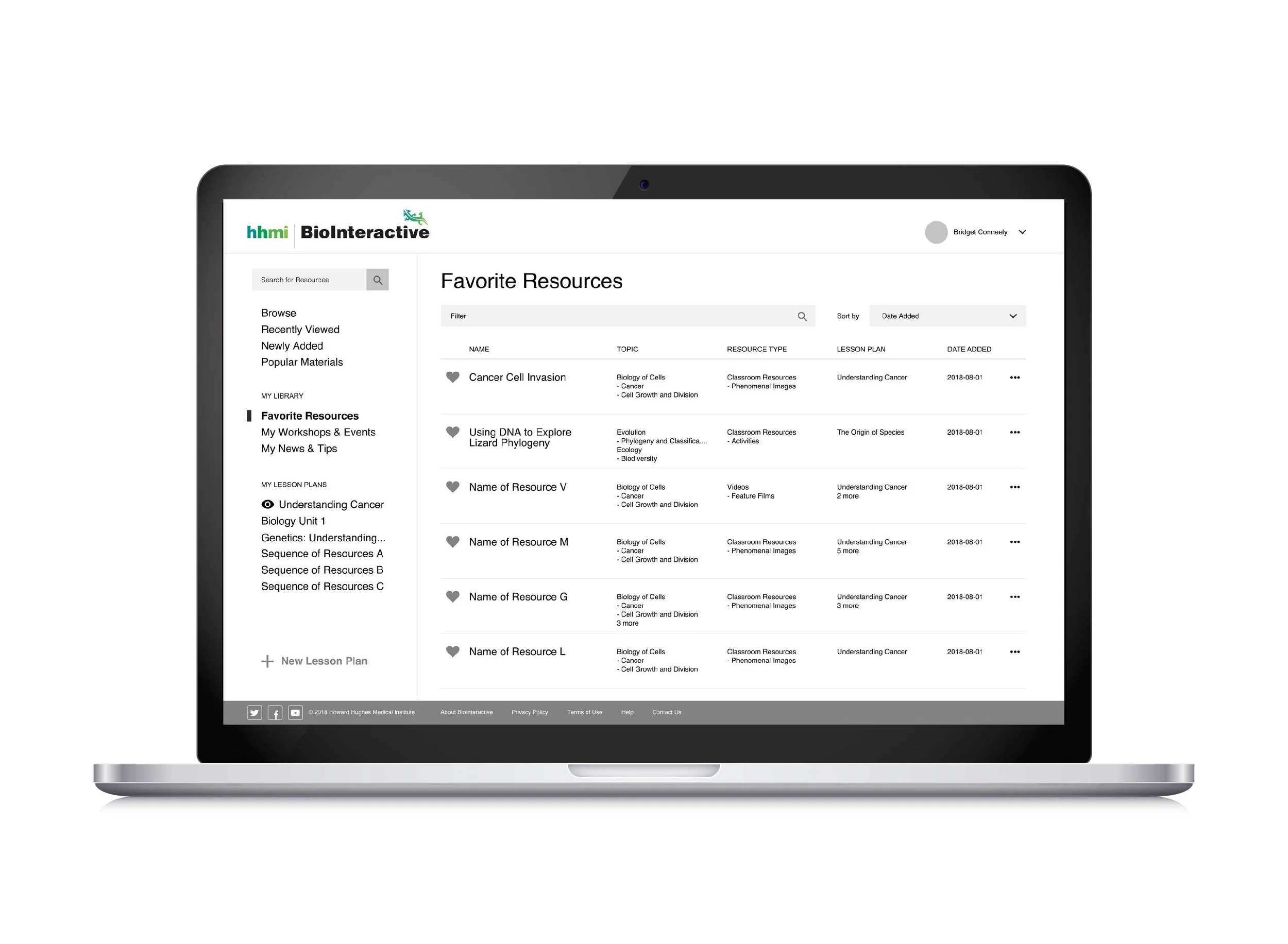
Favorite Resources

User's Resource Playlist
Resource
Researching Similar Sites
Throughout the process, I took inspiration from sites in other industries. Creating playlists of songs and seeing recommended videos grouped by categories is not an original idea. Though in the case of BioInteractive, we were applying this concept to the use case of creating playlists of resources so educators could save and organize BioInteractive resources to use in their lessons. By looking at comparator sites, such as Spotify, YouTube, Amazon Prime Video, Netflix, and Hulu, we were able to compare conventions and see how they provided users with personalized experiences.
Budget Estimation, Technology Recommendations, and a New Contract
At the end of discovery, my team delivered our best technology recommendations for the new site, a timeline, and a budget that would accommodate the features we planned to build. My role in this process was to make sure that the solution we were proposing would allow us to create a site that met the requests of our client and the needs of our users.
Kicking Off the Design Phase
To start off design, my team held a design workshop with the BioInteractive team. Led by the visual designers on the project, we discussed the current brand of BioInteractive, did a brand card activity to chose words that described the BioInteractive brand, and explored design preferences by looking at examples of current websites.
User Interviews / Usability Testing
To help guide the direction we were pursuing with the personalized logged-in experience, we decided to get direct feedback from our users. I worked with the BioInteractive team to write up the questions and to set up the interviews. We conducted them remotely through Zoom, which allowed us to interview educators from across the United States. We interviewed 10 educators total, 8 of which were apart of their Ambassador program and 2 other educators who used BioInteractive materials. Our participants represented a mix of teachers from high schools, 2-year colleges, and 4-year colleges, and another school which was for kids from a variety of educational backgrounds.
Before the interviews, we had each participant fill out a survey to tell us the grade-level they taught, the classes they taught, and a couple other fast questions. This was helpful in cutting down on the intro questions and allowed me to dive right in after a couple warm-up questions that got the participants comfortable talking. During the interviews, I asked questions related to the following topics.
Topics We Covered
How users would use the playlist feature
What we should name the playlist feature
User expectations for the logged-in portal
Initial reactions to wireframes, features, and content
Thoughts on a revised list of resource type and topic categorizations
Other feedback / requests
In the middle of the interviews, I had each participant pull up the digital prototype I had made of my wireframes. Being able to explain what a prototype was (and say it was black and white because we were focusing on the content and user experience) was key to allowing us to get the feedback we were looking for from our participants. By talking to our participants directly, we were able to keep them from getting frustrated with the prototype limitations (for example, only a few menu items were clickable). I was also able to ask follow up questions after they reacted to something in the prototype, which allowed me to gain more insight than if we had done unmoderated usability testing.
User Feedback
Amongst the feedback we received, a few points to highlight are:
The majority of our participants were excited for the resource playlists feature.
Among the options we gave for naming of this feature, "Resource Playlists" got the most votes.
Expectations / wants for the logged-in personalized dashboard matched well with the content in the wireframe. As predicted, participants said they wanted to see resources related to the courses / topics / grade levels they teach.
Participants liked the idea of being able to share their playlists with other teachers or students.
Implications
The insight gained during these interviews shaped multiple decisions throughout the following phases of the project. A couple of key implications included:
There were mixed reactions to seeing all the content in the top menu bar only available under "Browse." Some participants understood it, and one said she would rather always see that menu bar. This was key in the decision to have the main menu be accessible outside of the logged in menu.
4/10 participants requested the ability to add notes about how to use each of the resources in their playlist. One participant remarked that she would probably add different notes for herself and her students. This resulted in a new feature - the creation of public and private notes on resources in playlists - which gave added value to the user, and which turned out to be easier for our developers to implement while creating the playlist feature, rather than adding it in later.
Site Map and Content Model
During this part of the project, I focused on how the information architecture and technical architecture could better support educators by allowing them to find the content they are looking for on the site. Two key pieces of this were:
Site Map - In a spreadsheet, I outlined all the pages on the site for both the public version of the site and the logged-in version. A key difference from the old site included elevating the professional learning content, which was a goal of the BioInteractive Team.
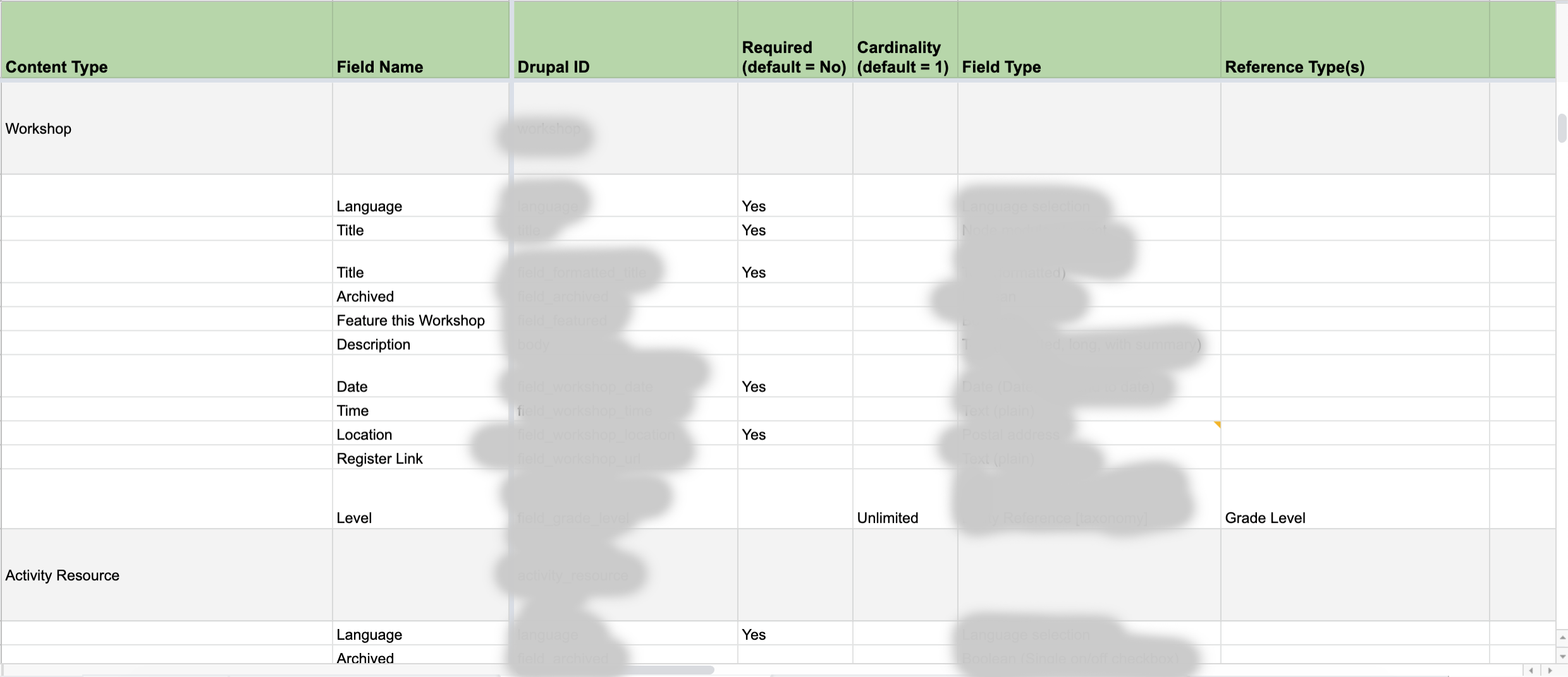
Content Model - In this spreadsheet, I worked with our developers to decide the content types and the fields we would need to build. With this project, we also made note of how the fields from the old site would map to fields on the new site to make content migration smooth. We also focused on how we would leverage taxonomies and entity references to other content types to relate content and make it easily findable.
Revised Wireframes and User Journeys
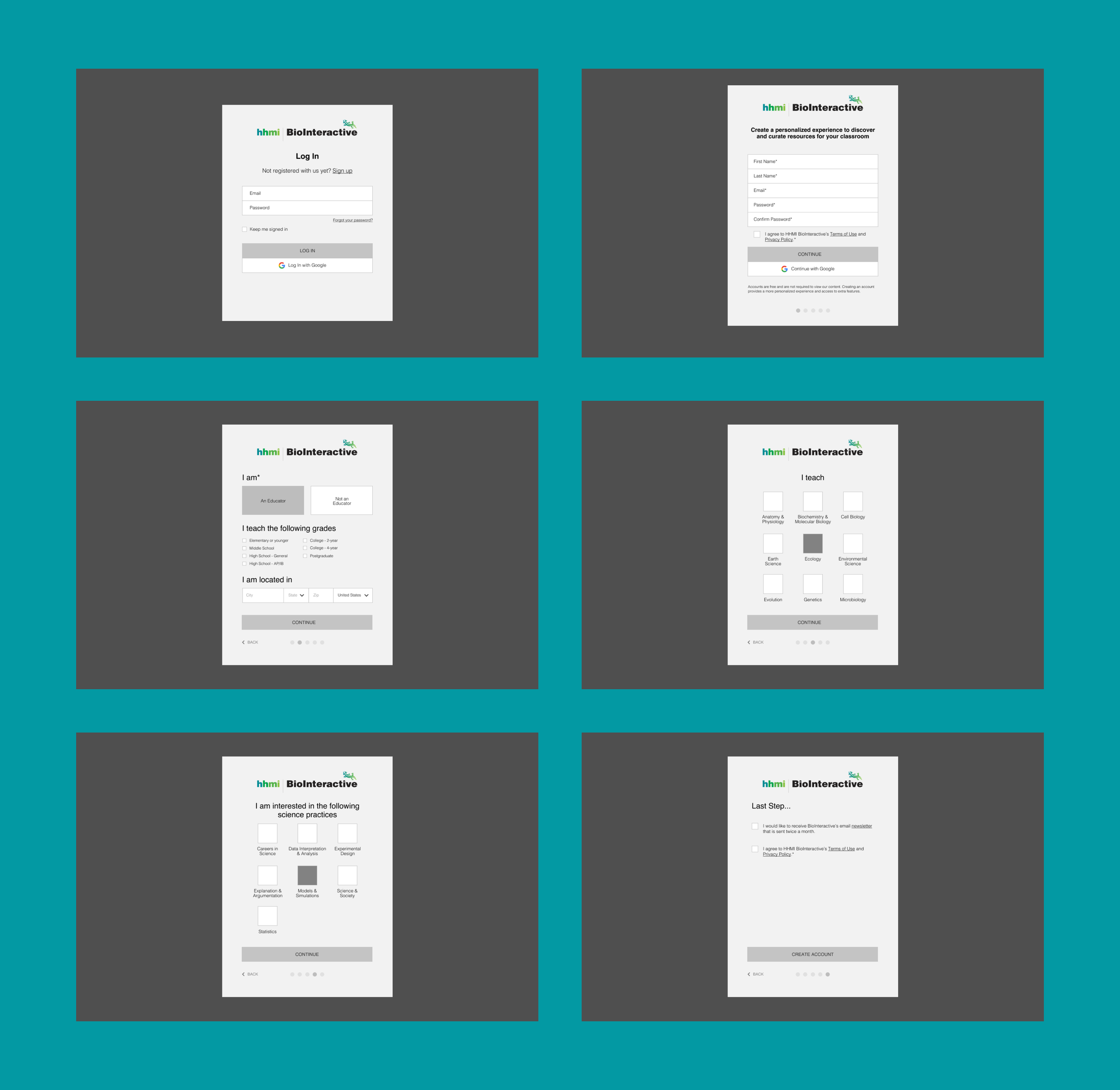
After testing, I continued to iterate on wireframes and create new wireframes, going through multiple internal reviews and client reviews. The prototypes below outline a few of the user journeys for completing the key tasks in the new logged-in experience.
Log In / Account Creation Process
Home and Resources
User Dashboard and Playlists
Visual Design
I did not own the visual design of the site, but I worked closely with our visual / interaction designers, Jamie and Corey, as they built out the visual designs.
Home Page and Professional Learning
User Dashboard, Playlist, Classroom Resources, and a Resource
Supporting Development
While visual design was still in progress, and even after the design phase was officially over, I did my part to support our developers and ensure the vision was carried through. I took part in many different activities:
Product Requirements - Together with our developers, I wrote requirements that outlined the high level functionality that we were on the hook to build. I led many of the review meetings with the client.
Acceptance Criteria Writing - I helped our developers answer the nitty gritty specific details of how things were supposed to function and how they should be built. Ex. Are we making this content section on the home page manually curated or automatically pulled in? We documented the answers to these in the JIRA tickets that we groomed together.
Sprint Review Planning Meetings - I attended these occasionally and answered questions.
Content Migration
Our team successfully imported data from the old site to the new site, trained the BioInteractive team to import manual content, and worked with them to test the new site. I wasn't very involved in this stage, but occasionally checking in to see how it was turning out.
Launch
Launch went smoothly, and we met the deadline we had set at the beginning of the project.
Indicators of Success
>1,000 user accounts created in the first month after launch
Positive feedback given to BioInteractive from users
Happy client


