ALS Association
Providing patient services and support to the ALS community
Project Type
Website Redesign
My Role
UX Support during discovery, UX Lead during design & deliver
Technology
Drupal
Tools
Sketch, InVision
Team Credits
Project Manager: Molly Mattessich
Account Manager: John Johnson
User Experience Designers: Courtney Clark, Maddie Purcell
Creative Designer: Acacia Betancourt
Analytics: Adam LaCaria
Technical Leads: Sarah LeNguyen, Deborah Fuzetto
Front-End Developer: Corey Lafferty
Back-End Developer: Jason Socha
Quality Assurance: Corinne Cooley, Stephanie Gutowski
Date launched: June 2020
The Client
The ALS Association is the only national nonprofit organization fighting ALS on every front - research, care services, public education, and public policy - giving help and hope to those facing the disease. The Association’s nationwide network of chapters provides comprehensive patient services and support to the ALS community. They are also known for the Ice Bucket Challenge, a viral fundraising campaign that raised $115 million in 2014.
Target Users
People with ALS and their families
Donors and peer-to-peer fundraisers
Caregivers and medical professionals
Sponsors and partners
Researchers
Anyone interested in ALS
Volunteers
Client’s Goals
The ALSA team wanted a new website that would help advance their mission to discover treatments and a cure for ALS, and to serve, advocate for, and empower people affected by ALS to live their lives to the fullest.
They wanted the site to be the go-to premiere resource for all things related to the disease and the organization.
They also wanted the site to house content from both the national organization and chapters, with chapter content elevated to users through geolocation.
Project Goals
Serve, inform, and empower the ALS community
Drive action & engagement (Ex. Donate, contact a chapter to get care services, sign up for the registry, volunteer, apply for a research grant, etc.)
Create a better digital experience for people with ALS by being accessible and mobile friendly
Provide a comforting and hopeful experience to those impacted by ALS, a degenerative disease
Elevate a consistent brand across national and chapters
Challenges
Navigating numerous stakeholders at both national and the chapters
Designing a consistent experience that could be used by all chapters
Key Takeaways
This project was one of my first big projects where I led the work of creating and presenting the majority of our UX deliverables. I learned a lot, and I also gained experience conducting unmoderated A/B usability testing.
The Process
Discover
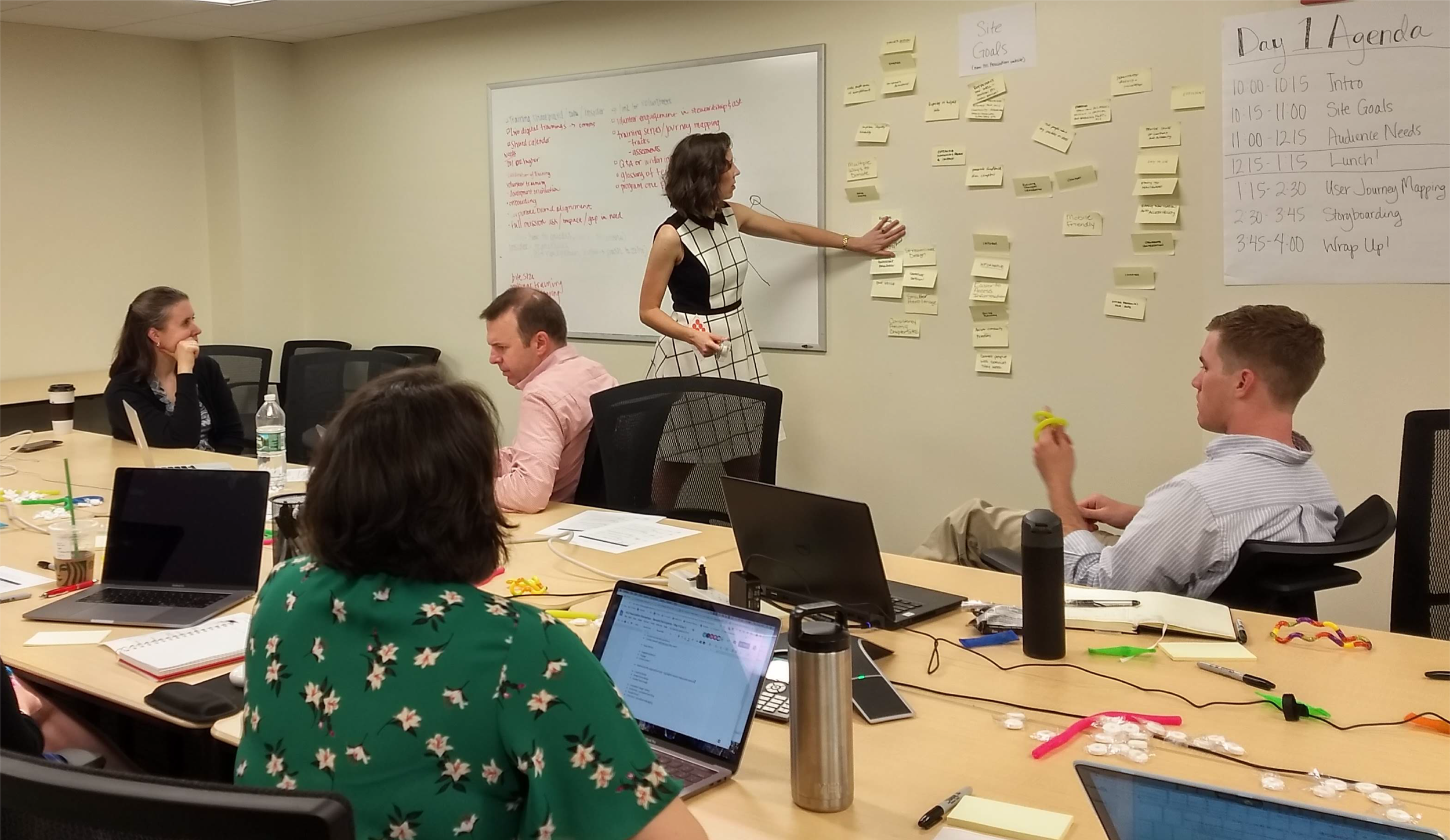
Conducted several workshops with the ALSA team.
Design
Created a site map, wireframes, visual design, and a content model. Ran usability tests to test content and user journeys in the wireframes.
Deliver
Built a complex Drupal build that integrated with Classy for donations and Salesforce, and which used geolocation to match users with their local chapters.
Launch
Entered content, tested the site, and launched to the public.
Discovery Research
To learn about ALSA’s goals, audiences, desired features, and brand, we conducted an in person workshop with the ALSA national team and a Zoom workshop with one of their chapters. I supported my teammates with workshop prep and support during the sessions.
Site Map
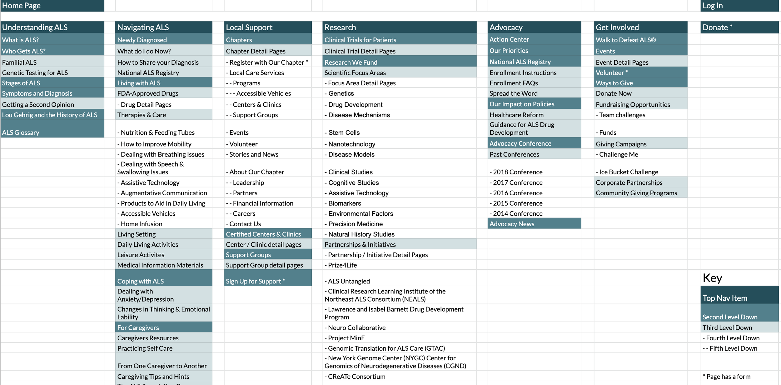
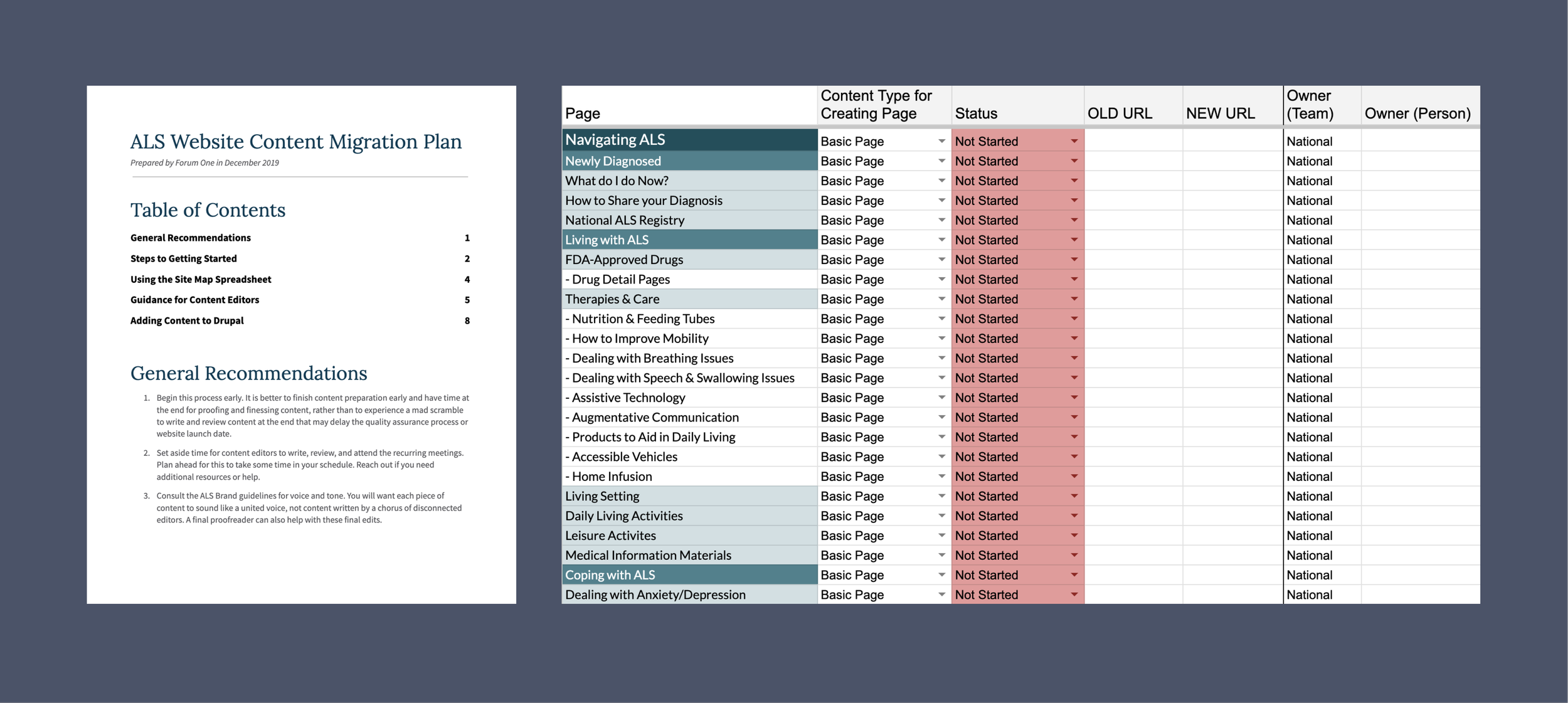
The national ALSA site had over 2000 pages when we first began this project. I was tasked with figuring out what pages were a priority for users, and how we should organize them on the new site. With a mixture of analytics, best practices, and knowledge from our client about user priorities, I created a new site map. Not only did this site map account for national’s pages, it also accounted for content that chapters’ would have.
Wireframes
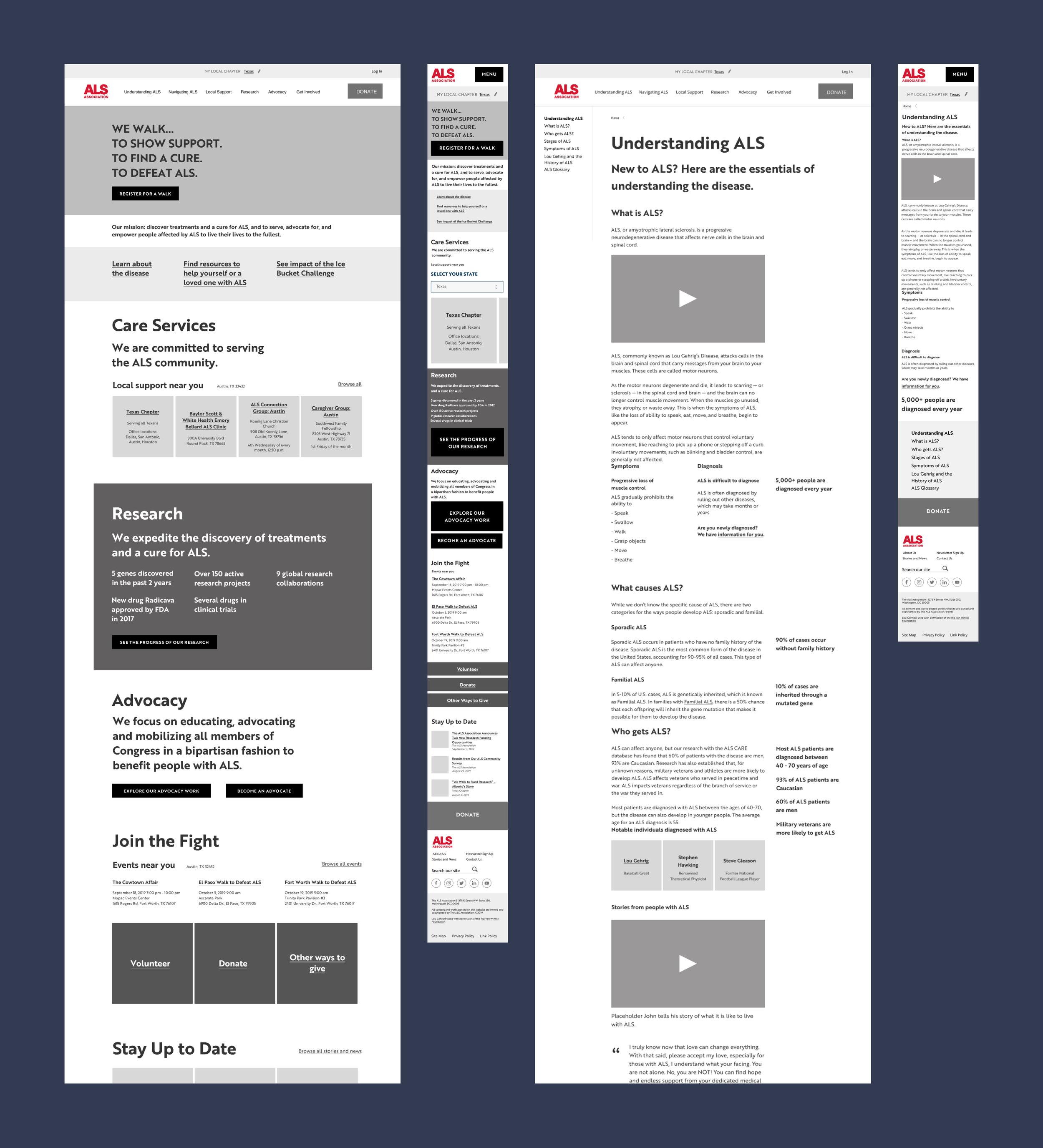
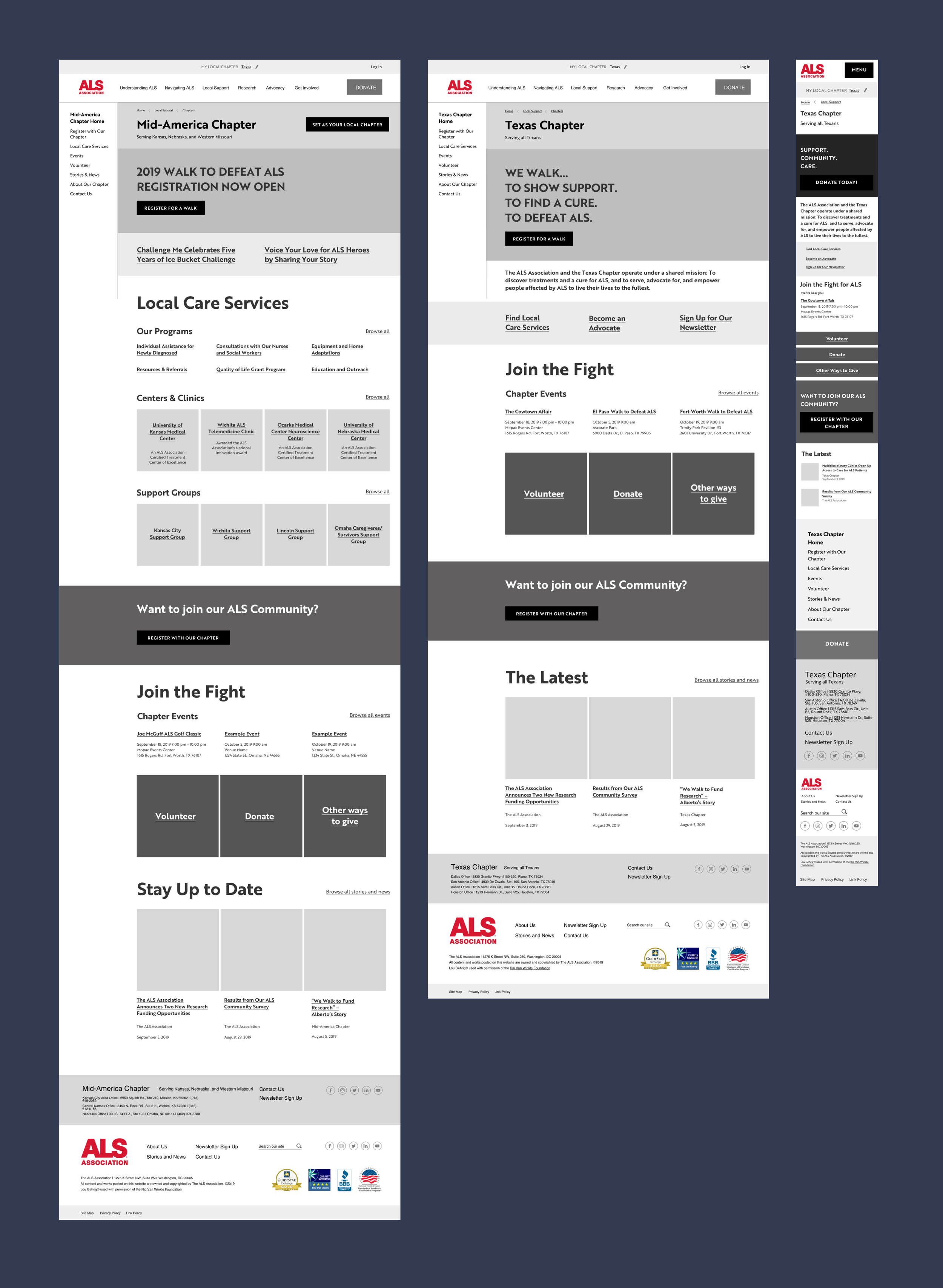
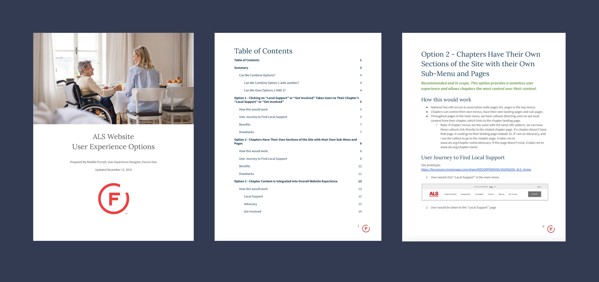
I created wireframes for the main pages of the site, presented them to both national and chapter stakeholders, and made revisions.
Unmoderated A/B Usability Testing
Our client was interested in testing to see how users would donate. They were particularly interested in seeing user preferences of where they wanted to donate and how they would go about doing that. To answer this question, we ran unmoderated usability testing with a tool called Validately. We ran a total of four tests - Test A on Desktop, Test A on Mobile, Test B on Desktop, and Test B on Mobile. Each test had the same set of questions, but with a different pre-selection on the donate form, and either on mobile or on desktop. The two pre-selections on the donation form that we tested were:
Test A: The donation form had “Greatest Need” pre-selected under the “Donating to” dropdown. This option denotes that the user’s donation will go to whatever area is needing funding at the moment.
Test B: The donation form had “Texas - Chapter” pre-selected under the “Donating to” dropdown. The assumption behind this option was that if a user had a home chapter selected or were geolocated to Texas, that users would want their donation to go to that chapter, and so, it was preselected for them.
What We Found
Participants easily found the donate buttons in our wireframes, and we learned which buttons participants gravitated towards on desktop and mobile.
Participants who had Test B noticed that their “local chapter” was set to Texas and that was why they were seeing content in the prototype related to Texas. These participants did not react strongly to the fact that it was pre-selected on the donation form. It either made sense to them or they were only slightly surprised.
In all tests, regardless of if the “donating to” drop down was already pre-selected to the correct option of where to donate (as instructed by the test) or not, the majority of participants opened the drop-down anyway. They were curious to see what their options were. This led to our recommendation that it was ok to not have anything preselected for where the donation would go.
Visual Design
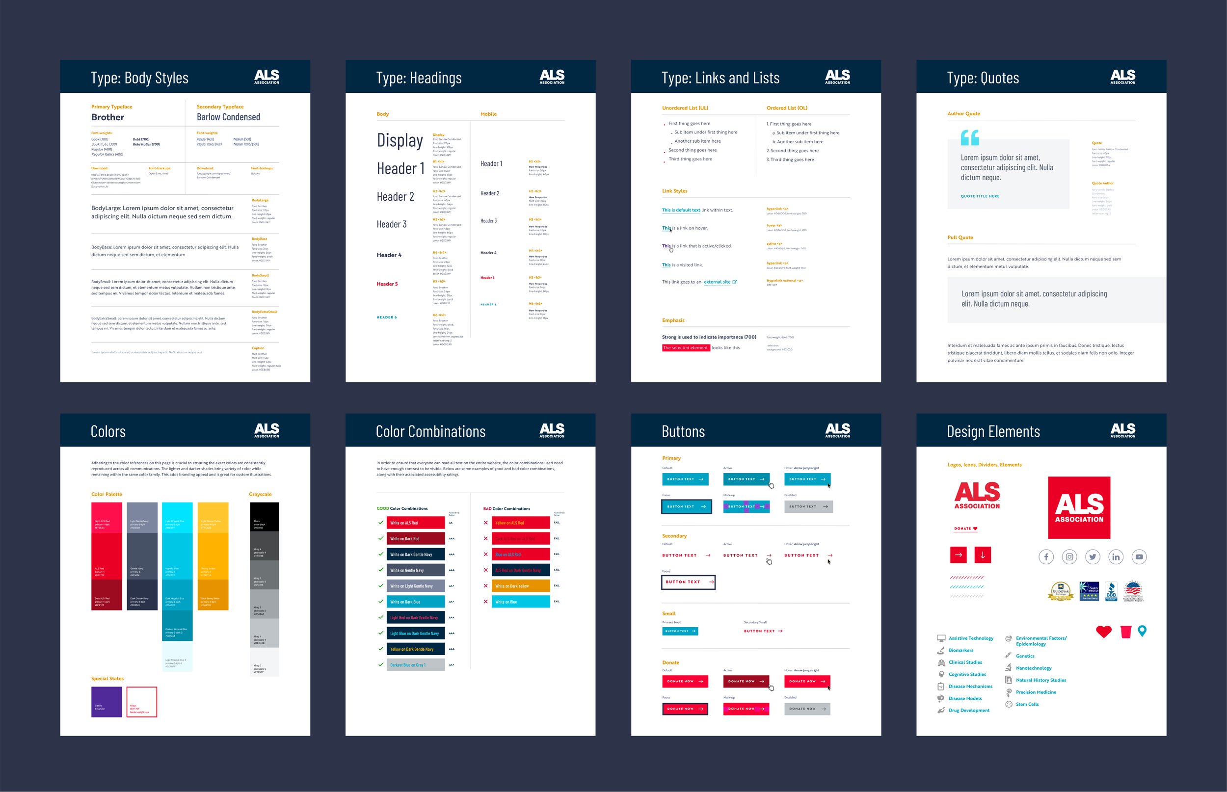
During this part of the project, I supported and collaborated with our visual designer on the project.
Content Model
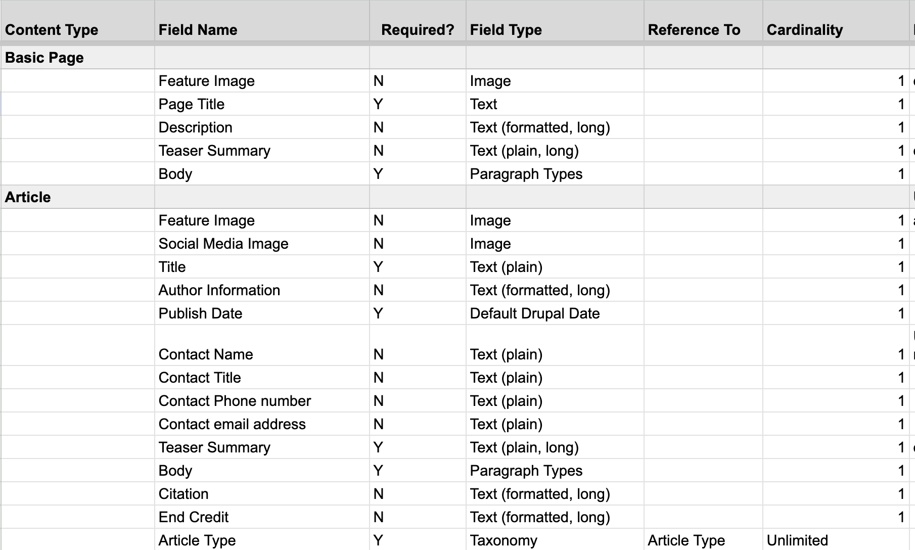
I worked closely with our tech lead to create the content model for this project, outlining all the fields we would need on our content types and which taxonomy categories we would need.
Development & Quality Assurance
During development, I was less involved, but I did join review meetings occasionally and did design QA when necessary.
Content Loading & Testing
To help our client plan for content on the new site, I created a guide that outlined how they could use the site map, the content model, and the wireframes to prepare their content. Our project manager and tech team guided them through actual entry of their content into the site.
Launch
The new website launched in June 2020.


