AllergEats
A digital resource serving your allergy and dietary needs.
Project Type
New Mobile App
My Role
UX Designer & Researcher
Course
SI 482: Interaction Design
Tools
Figma, InVision
Team Credits
So Yun Jin, Leon Ma, Selena Moeljadi, Maddie Purcell
Date: 2016
The Problem
People with food allergies and dietary restrictions often encounter difficulties finding places they can eat out at and figuring out which menu items they can order, especially when in an unfamiliar town.
Target Users
People with food allergies and/or dietary restrictions.
Project Goal
Design a mobile app that helps people with food allergies and dietary restrictions find restaurants that accommodate those restrictions and by showing them which menu items they can eat.
Challenges
Taking all of our ideas and narrowing our focus to make concrete design decisions.
Making design decisions with limited user research, as this course focused on learning about the design process rather than user research.
Key Takeaways
This class introduced me to many design methods, including paper prototyping, and gave me experience of working to solve a problem through design.
I also learned how to use Figma, a design tool that makes collaborating easier, and InVision, which is a useful prototyping tool.
Problem Identification & Approach
For this class, we were presented with the prompt from the CHI 2017 Student Design Competition and were asked to think of a design problem that we could address in order to "level the playing field." When thinking of possible social problems that we could potentially solve with design, we identified the challenge that people with food allergy and dietary restrictions face - that of watching what they can and cannot eat at a restaurant. The underlying problem stems from the lack of information available. With our app, AllergEats, we are leveling the playing field for people with allergy and dietary restrictions by helping them find restaurants that accommodate their restrictions and by showing them which menu items they can eat.
Project Pitch
Dining out is such an essential part of our social fabric that finding a way to do so as safely as possible is a problem that needs a solution. So what if we all got together and helped each other? What if we all shared our dining out experiences for the benefit of everyone else in the food allergy community, and they did the same thus benefiting us? Our project is devoted to helping those with allergies become more educated about their meal options at local Ann Arbor restaurants, while also providing crucial feedback about each other’s positive or negative experiences. By sharing information, it benefits the greater community, leveling the field by making eating out a smoother, more enjoyable, and delicious process to those with allergies or dietary restrictions.
AllergEats is the digital resource that will ensure quick and easy access to information, and through a map visual, users have a bird’s eye view of their options throughout the city, now having the opportunity to narrow down their options through a series of preference filters. The crowd sourcing function where users are able to submit feedback about restaurants who have made changes to the menu or have added new dietary restrictive dishes that will allow restaurant information to be up-to-date. For the restaurants, having a presence on the app will promote their business. It will also incentive them to really start thinking about more allergy-friendly dishes they can provide. All in all, it will not only change what people eat, it will revolutionize how people go about eating, no longer making a certain allergy or diet restrict their ability to dine out and have a good time.
Competitive Analysis & Design Ideation
In preparation for our design solution, we looked at existing competitor applications that also cater to helping people eat out.
Competitor Applications
Strength
Filtering for allergies
Crowd sourcing feedback from users
Weakness
No filtering for dietary restrictions
No way to search by cuisine type
Strength
Location-based search for restaurants
Weakness
No filtering for allergies or dietary restrictions
Strength
Filtering for dietary restrictions
Weakness
No filtering for allergies
Strength
Crowd sourcing feedback from users
Location-based searching available
Weakness
Only focuses on finding places that are gluten-free
Strength
Crowd sourcing feedback from users
Cuisine type and location-based search options available
Weakness
Does not highlight or focus on allergies or dietary restrictions
Strength
Reservation feature makes planning a meal with a group easy
Weakness
Does not highlight or focus on allergies or dietary restrictions
Our analysis of these applications allowed us to identify the main factors we wanted to include in our app in order to serve our target users. Since many apps that attempt to address a similar audience already exist, we wanted to set our app apart by aiming to combine the many strengths of our competitors into one place and be able to serve both people with allergies and people with dietary restrictions. Building upon ideas from our competitors, we identified the following main design factors, which we included in our app.
Main Design Factors
Personas, Scenarios, & Storyboards
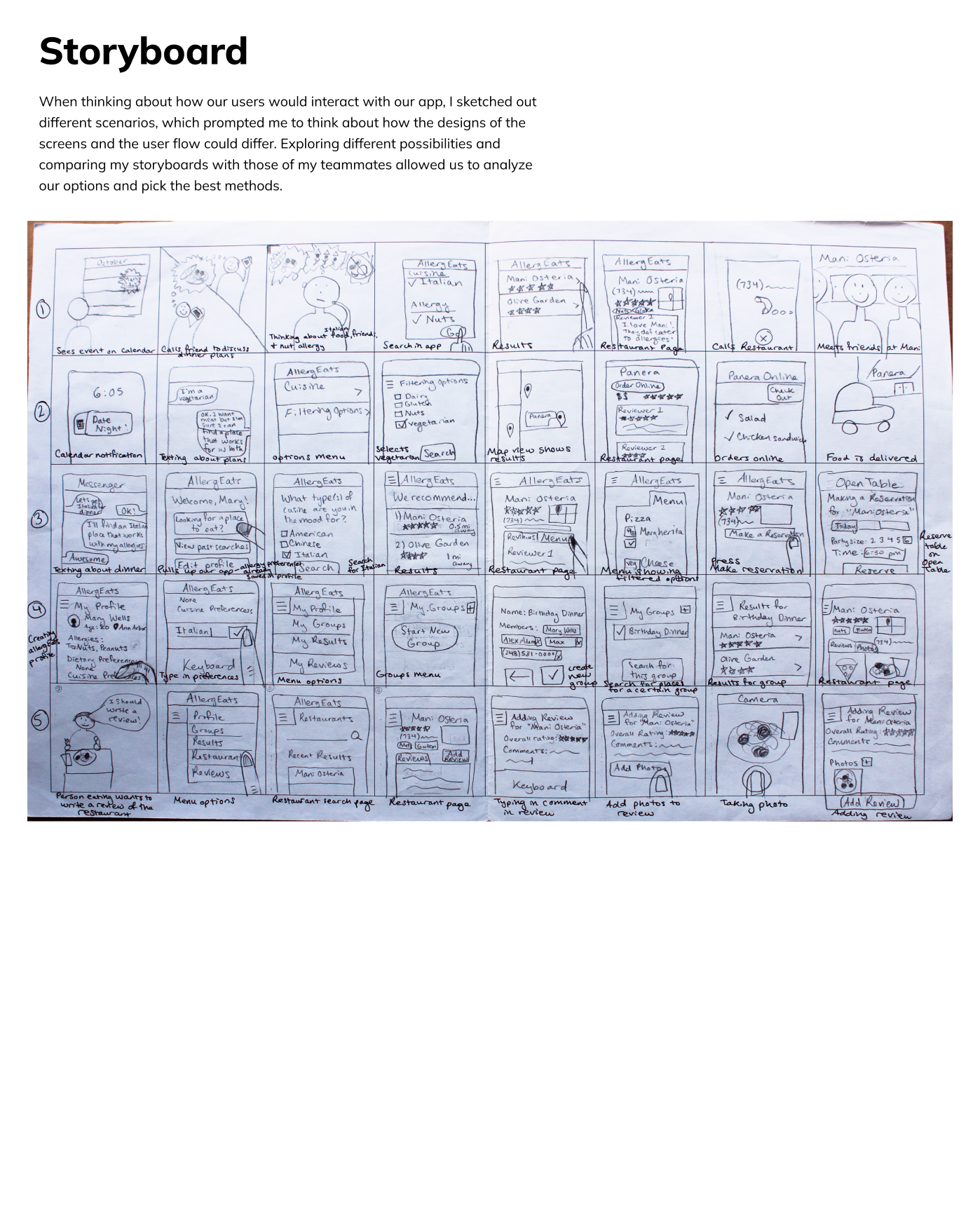
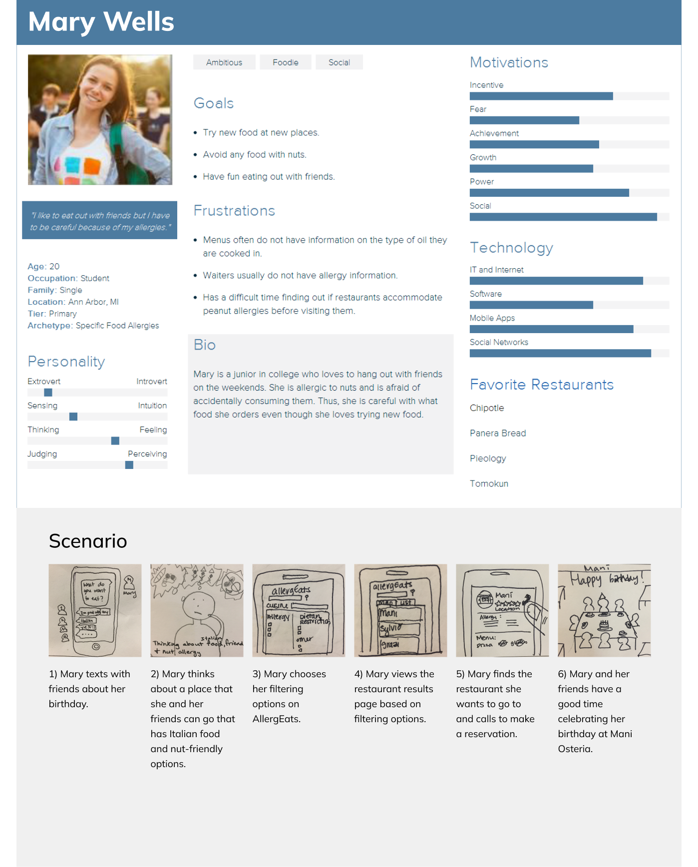
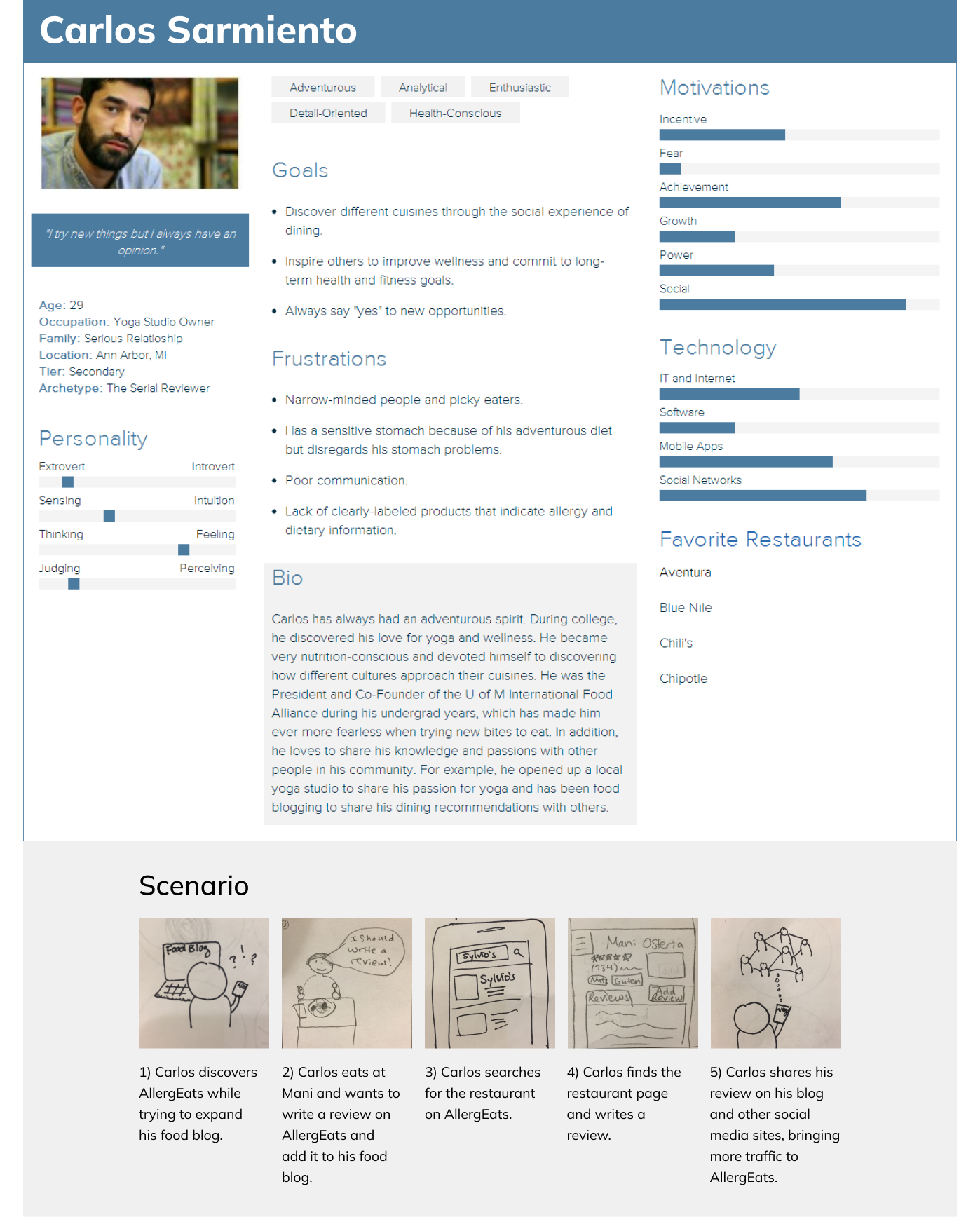
Next in the design process, we thought about who our target users were and created personas to make them more concrete. We then sketched out storyboards to help us think about the possible situations our users would use our app in and what their user process would look like. Altogether, we compared storyboards and composed specific scenarios that corresponded to our personas.

Exploring Possible Scenarios Through Storyboards

Primary Persona: Mary, Has Allergies

Secondary Persona: Carlos, Food Blogger, Has Stomach Issues
QOC (Question, Object, Criteria) Analysis of Storyboard
This design exercise prompted us to think about some of the basic fundamental design decisions that we had to make as a team. We first posed design questions, such as those below, explored our options for how we could meet them, and identified the important criteria of each one. We then made decisions based on the weighing of each option.
Paper Prototyping
Next, we identified the main screens of our app and created paper prototypes - an easy, low-cost first prototype. In class, we tested our paper prototypes by having testee users interact with them and having one of our team members move the pieces according to what the testees tapped with their fingers.
Design Addition
"Are the allergies displayed only the ones I select or does the app show all allergies, regardless of if I filter them?"
- One user during a user test
This question got us thinking about if we wanted our app to show users only the information they find relevant on an individual basis, or if we want to show all allergy & dietary information for a restaurant. We decided to show all accommodation levels on a restaurants profile in case a user does not know they have a food allergy and later react, which our app could then help them identify the cause of that reaction, or in case they are also using the app to order for a friend.
However, we understand the confusion and so, in the settings, we added the option so users can select which one they would like to view. Then depending on the user and the use situation, users can decided whether they would like to see all of the accommodations or only the ones selected.
Digital Prototyping
We decided to create our high-fidelity digital prototype by creating the screens in Figma and then mapping the interactions on them in InVision. We chose Figma based on its ability to allow our team to all collaborate on the project at the same time and view each other’s progress in real time. InVision then allowed us to take our screens and make an interactive prototype.


